

Here at Engenius we talk a lot about user experience (UX). Since we design websites every single day, we live and breathe UX. Every experience we have with a product or service causes us to analyze what went well, what didn’t go so well, and what improvements could be made. In this article, you will learn what UX is, why it’s critical to your business, and how to avoid disappointing your audience by doing it wrong.
What is User Experience?
To put it one way, the user experience is the level of satisfaction (or dissatisfaction) that your website provides to every visitor. This satisfaction level is determined by many different variables, including the layout, ease of navigation, and the intuitiveness of user journeys, from purchase to checkout.
No matter the function of your website, having a satisfying user experience is critical to the success of your business. Good UX design helps your users accomplish their goals, which in turn helps you accomplish your own. Here are three techniques to help you avoid disappointing your audience with poor UX design.
Know Your Audience
The most important task any company must undertake to achieve success is to know and understand its target audience. The web is no different. Learn some important steps you can take to figure out who makes up your ideal audience.
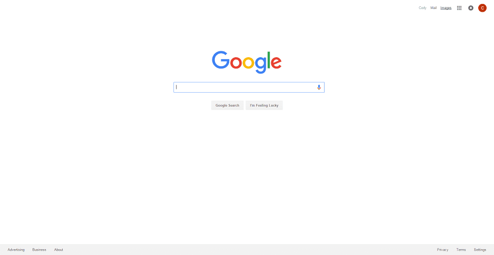
Google knows the large majority of its users are there for one thing – search. Their homepage is built accordingly.
Base Your Navigation On User Goals
Once you understand the needs and goals of your audience, the next step is to organize the architecture of your site around those goals.

Imagine if a retailer put their number one selling product at the very back of the store, on the highest shelf, hidden behind other unpopular products. That would be a costly mistake! Most traditional retailers understand this philosophy, but unfortunately a lot of website creators do not.
Most of the time, when a business designs their website and considers the information architecture, they decide to organize their site map based on their organization’s structure or using departmental language. This is most likely the case because the site map is usually completed by a team within the business. While this makes sense, this too is a mistake that will unnecessarily cost your business time and money!
Instead of basing navigation on how the organization is structured, it should be organized around the goals of your users.
Always Consider Mobile First
Knowing what devices your audience use is a big factor in designing user experience. Chances are, at least half (and probably more) of your visits are from mobile devices.
If this is the case, why do most website creators design for desktop first and mobile second? By this time, we should be switching our methodologies to always consider mobile first and desktop second.
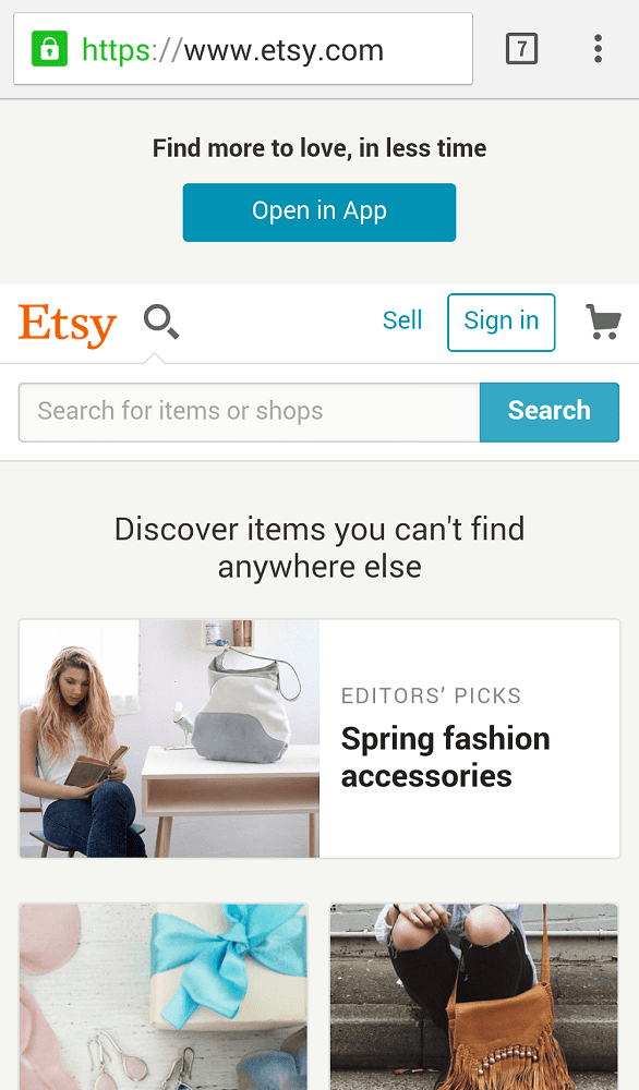
Etsy caters to customers who are searching for specific items or looking through categories, even on mobile
What does this look like? Of course it’s responsive web design, but in reality, it’s much more than that. The concept of “mobile-friendly” has been around for a while now, so most website designers understand that on mobile certain elements should resize, and columns should stack. This just makes sense.
But when considering mobile first, strategy goes deeper than just resizing and moving elements around. You must start thinking strategically about minimizing the calls to action to the primary goals of your mobile users.
For example, most users that are on mobile devices are actively out and about, which means they don’t have a lot of time to sit and surf. They just want to get what they are looking for and go. Most times this could be a phone number, email address, or directions. It’s critical to make this information readily accessible on mobile.
Key Takeaways
- Break up your users into segments based on their goals
- Organize your site structure based off of your users’ goals rather than your organizational structure
- If your website is not mobile-friendly, your users are having a negative user experience
- Designing for Mobile-first is more than just being mobile-friendly; it involves strategically minimizing content to the primary goals of your mobile users.
If you can master these basic concepts, you will be well on your way to offering a positive experience for your users. You will captivate your audience and eliminate the “Should I come back to visit again?” question from their minds.
Now let’s hear from you. What else are you doing to ensure your audience is having an enjoyable user experience? Are there any key tips we missed? Let us know in the comments below!

Start the Conversation
Interested in learning more about UX design and how to improve it?


