Blue Ridge Health is not just a health center. It’s a community health center with roots in compassionate care for ALL of Western North Carolina’s most vulnerable populations. As a Federally Qualified Health Center (FQHC), Blue Ridge Health is a nonprofit that provides a variety of services, including medical, dental, and mental care to all people regardless of their ability to pay.
”It takes a lot of time and thought to develop and maintain a web site that is current, informative, visually appealing, and easy to navigate. With Engenius, we feel like we have a true partner in this work, people who really care about our organization – from Kory who first offered us solutions, to Molly and Ellison who helped us put a map, words, and pictures to our ideas, to Cassidy and the team who help me problem solve on the regular… everyone at Engenius with whom we have worked has been quick to respond, creative, intelligent, kind, and supportive. And our web site is gorgeous to boot! Highly recommend this team. Five stars!
Charley ThompsonCommunications Manager
Background
Objectives
- Effectively communicate Blue Ridge Health’s mission, vision, and purpose to all of its audiences through cutting-edge web design.
- Be easily navigable by all of Blue Ridge Health’s primary audiences, allowing them to find the information they are seeking quickly and efficiently
- Be optimized for web design industry standards and utilize Blue Ridge Health’s modern branding throughout the site
- Be easy for the Blue Ridge Health team to update and maintain going forward
Solution
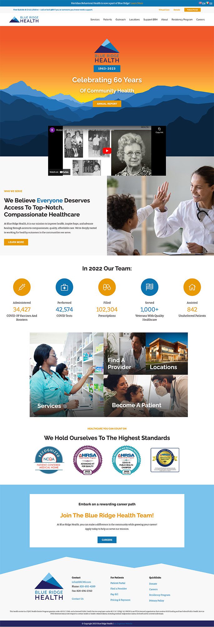
- Blue Ridge Health serves a large territory spanning Western North Carolina. It was critical that the website not only communicate the wide variety of services Blue Ridge Health provides — like dentistry, pediatrics, pharmacy, screening, and vaccinations — but also showcase the organization’s locations, many of which serve rural, hard-to-reach populations.
- To achieve the above, Engenius worked to create a navigation that would help users find what they were looking for quickly and efficiently. “Services,” “Patients,” “Outreach,” and “Locations” are the first menu items a user sees, emphasizing Blue Ridge Health’s primary goal is serving patients.
- Other main navigation items highlight ways to support the nonprofit’s work financially, get involved as a resident physician, or learn more about the nonprofit’s history — all of which appeal to specific audiences Blue Ridge Health wants to target.
- As for design, key statistics, graphics, and photos are used intentionally throughout the site to highlight the personal and real impact of the organization, showing donors and sponsors exactly who they are supporting — individuals in need of medical care in rural communities.
- The new site also exhibits a modernized look and feel. The brand colors, which consist of varying shades of blue and orange, pop against the white background. Viewed holistically, the website’s color scheme subtly emphasizes the nonprofit’s territory: Western Carolina.
- Following the launch of the website, Engenius hosted a training session for the Blue Ridge Health team and provided a recording of the training along with a PDF manual with further instructions.
- While the old Blue Ridge Health site was built on an older, outdated platform, their new WordPress website is simple to update and the team is able to make changes quickly and easily.
- Support tickets to the Engenius team can be submitted for assistance with any needs, and Engenius provides regular maintenance on the back end of the site. As the site continues to age, website optimization efforts will keep it running smoothly for future users.
- The new Blue Ridge Health website is easy to navigate, easy to keep up to date, and ready to scale as the nonprofit continues to grow into the future.

