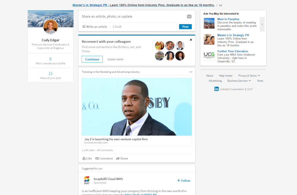
Have you logged in to LinkedIn lately only to be dazzled by a brand new design? LinkedIn has rolled out its biggest redesign yet, making the entire site simpler to navigate for users like you.
If you are feeling the same betrayal you feel every time you have to update your most used software or are faced with a new user interface on your computer or phone, you are not alone. Change is hard.
Concerned whether these changes are good for you? Depends on how you respond to them. Here are some quick LinkedIn profile tips on how to adapt your pages, both personal and business, to make sure you are a shining star in the realm of LinkedIn redesigns.
Personal LinkedIn Profile Tips

Update your profile today to be the best LinkedIn version of yourself.
1. In Summary, Simplicity is Key
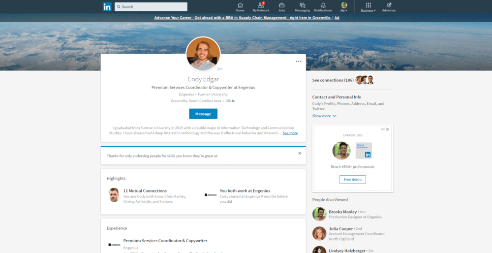
Your profile has been simplified, starting with your summary. LinkedIn now shows your summary in your top box, displaying the first two lines before the ever-so-disruptive “See More” button. Strategy here is key. Use a clear call-to-action to entice the viewer so they want to see more of that summary you spent so long perfecting.
2. The Best of the Best
You need to be a lot pickier when it comes to your top skills. Due to the redesign, LinkedIn now only displays your top three skills under “Featured Skills and Endorsements,” with another dreaded “See More” button. This means your most unique and impressive skills should be at the top of your list. I’m looking at you, cloud and distributed computing specialists.
3. Quite the Accomplishment
Projects, patents, certifications, you name it — it’s all in one section now. For those of you with a long list for each of these types of accomplishments, it may be time to shave off the less impressive scholarship you received in college or the certification that expired a few months ago. LinkedIn will automatically display your top item in each category, so cut down on the bulk and let your most impressive accomplishments shine.
Company LinkedIn Profile Tips

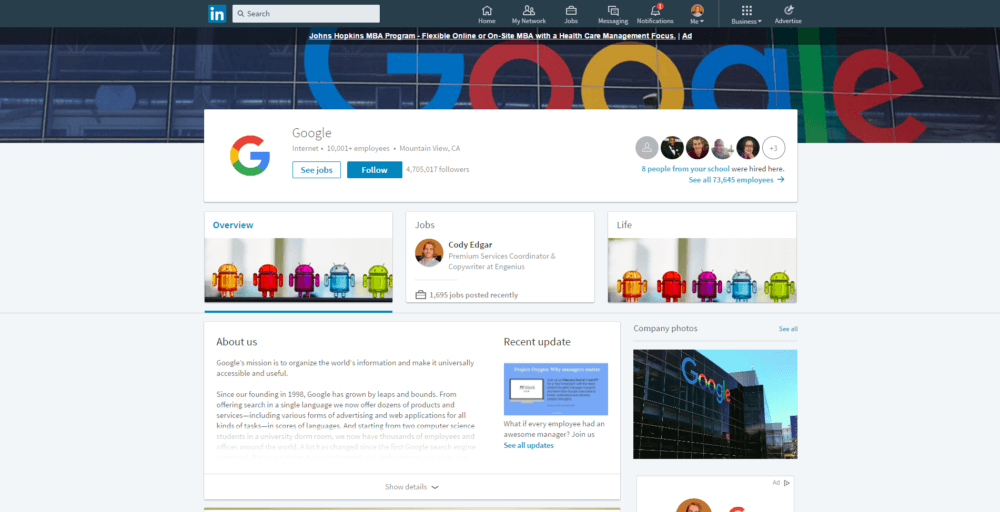
These updates are only seen on mega-company pages like Google and IBM for now, but here is how to prepare for what is coming to your business page soon.
1. Be in the Business of Social Networking
The new company page layout feels even more like a Facebook page for your business. All of the information is organized into Overview, Jobs, and Life. This means that your updates (read: blogs, shares, etc) are now a bit harder to reach at the bottom of the Overview section. In the true spirit of social media, make sure you keep your posts circulating so they don’t end up sleeping in the corner of your company page.
2. Let the Job Seekers Find You
The Jobs tab makes posting open positions even simpler. Local job seekers can easily see what is available at your company as well as what type of people work for your company. The “Employee Insights” sections helps potential applications get a feel for if they are the right fit. Keep this page updated and increase your applicant pool.
3. Show ‘Em How #Cool You Are
Wishing your company’s culture shined brighter through your LinkedIn page? The Life page is a great addition for you. Dig deep into what makes your team the best to work with, both for potential clients and job seekers. It looks like you will have the opportunity to include videos and pictures that help prove your point.
These LinkedIn profile tips will help you start to navigate the new and improved social network.
Start the Conversation
Want more help navigating the wonders of social networking, even with the surprise of a redesign?


