
WJCB is a large law firm with offices in 7 cities across 3 states. In 2020 they decided to update their branding to better reflect their unique culture and identity. WJCB came to us with a new logo and set of brand colors, looking to our development of the website to help inform the way they used their new brand across other mediums.
Website Design & Development
Content Strategy
We helped WJCB define their style.
”Working with Engenius for the redesign of our website was one of the best decisions we made. The entire team took the time to get to know our vision and goals, but also helped us stay ahead of schedule and on-budget.
The web designer we worked with consistently blew us away with her work product, and her design has become the new standard we expect in our web presence. Because of Engenius, we have a website that aligns with our future goals and deeply reflects our unique identity in the market. We feel confident we’ve found a partner for the long run.
Jordan O. SmithFormer Operations Director
Background
Objectives
- The WJCB team knew they were looking for a website that was modern and clean with plenty of white space. They liked grid styles, load-in animations, and full-height sections with photography.
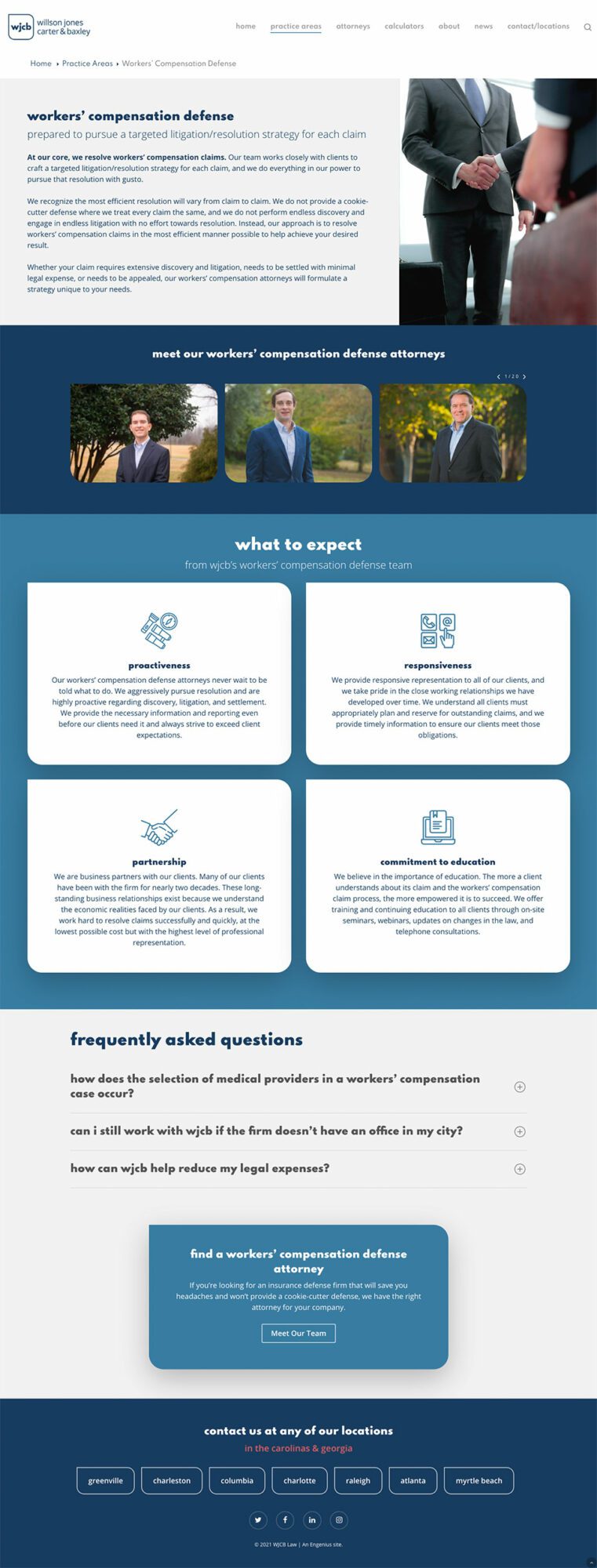
- WJCB also wanted to focus on its greatest asset — its attorneys — throughout the Southeast. We needed to make sure that all paths led to an easy way to contact a specific attorney or office location.
Solution
- The most defining characteristics of the new logo are its shape and the use of lowercase typography, so we chose to capitalize (pun not intended!) on those elements. Rather than using strong right angles, we made sure every corner throughout the site was slightly rounded, and, in many places such as the calls to action, we used the logo’s style of three rounded corners and one right angle. These created a very cohesive feel to the site. We also used heavy lowercase lettering for headlines to match the logo.
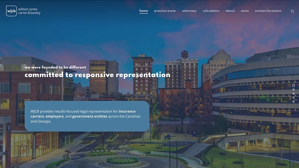
- The color scheme for the new brand is a wonderful combination of more traditional “business” blues and a contrasting, attention-grabbing coral. We utilized all of these colors throughout the site, being sure to use the coral sparingly so that it didn’t lose its ability to surprise. We also sought out stock photography that complemented the color scheme.
- The multiple locations and 75+ attorneys are highlighted throughout the site starting with cityscapes and scenery from each location in the hero section of the homepage. The attorneys can be found by practice area, location, or in an overall directory on the Attorneys page. Each attorney’s profile includes not just a bio, but also multiple means of contacting them directly or through their paralegals or assistants. Finally, each location has its own page with full contact information.