What is Dark Mode?
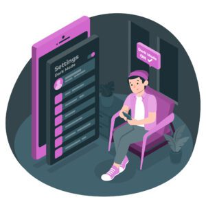
Unless you’ve been purposefully avoiding social media and the latest web design trends, you might have seen a growing amount of social media platforms and other software systems offering a “Dark Mode” or “Night Mode” setting. The setting is a simple display switch: where once your screen or app appeared as a white or light-colored background with black text, it now displays as a black screen with white and/or light-colored text. The feature, also called dark theme, night mode, and other similar variations, is an inversion of the traditional digital color palette that claims several key benefits.
 The Potential Benefits of Dark Mode
It reduces eye strain.
One of the most common benefits attributed to Dark Mode is that it helps alleviate some of the eye strain caused by constant device usage and blue light exposure. Dark Mode is considered less glaring, less jarring, and less overwhelming to already overwhelmed eyes. While this sounds great, the science behind this claim is inconclusive. Still, fans of Dark Mode argue that the darker screen is helpful and reduces the glare from white pages and bright contrasts.
It can help your battery last longer.
Like the potential benefit above, Dark Mode’s impact on battery life is still being determined. It stands to reason, however, that a darker screen requires less energy to illuminate and early studies confirm that theory. Dark Mode does improve battery life in OLED screens. Will switching to Dark Mode instantly give your devices hours more of battery life? Probably not. But will Dark Mode help save your battery life in the long run and give you up to an hour more usage? Potentially so.
It’s trending.
This might be common sense, but it bears repeating: Dark Mode is trendy. Facebook, LinkedIn, Twitter, emails apps, and more offer the feature as one of several display options. It seems that many users prefer the sleek, dark interface to the brighter colors, and offering Dark Mode as an option empowers users to select their own design aesthetic, giving them greater control of their user experience.
Why is Dark Mode relevant to my organization?
Glad you asked! Let’s walk through a short, timely example.
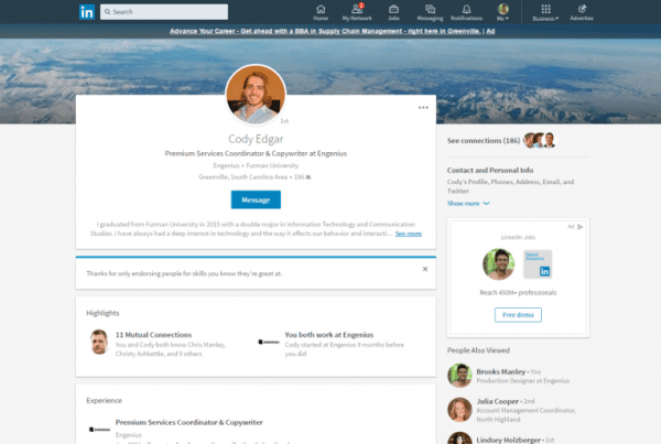
 At the end of October 2021, the social media service, LinkedIn, rolled out Dark Mode. As of today, LinkedIn’s 774 million users now have the ability to scroll, post, and search content with a new, dark interface. Per LinkedIn, Dark Mode was a highly requested user feature, but while the change is visually refreshing for users, the new display option increases complications for brands.
While Dark Mode doesn’t impact you or your organization’s ability to post on the service, Dark Mode does impact your logo, designs, and graphic content. How does your logo show up in a black environment? Do you lose the integrity of any logo lines or spaces? Are your graphics overly dark? Will your content stand out or blend in?
While organizations previously only had to think about a lighter design landscape, they must now consider their graphics in two separate aesthetics: light and dark.
As more of the world moves towards a Dark Mode interface, it’s important to review your company’s graphic content and make sure that it’s still relevant to the designs and trends of the modern web.
What to Review When Updating Graphics for Dark Mode:
- Ensure all logos and images are visible in Dark Mode
- If none of your logos fit well on Dark Mode, consider updating your brand standards.
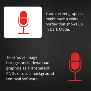
- If you don’t want a white background around your logo or image, export or save the file as a transparent PNG.
- If you cannot download a transparent PNG, consider a software service to help you remove backgrounds from your images. (We have used Canva to do this in the past).
- Opt for brighter text when communicating important information on dark backgrounds.
- As you review graphics for Dark Mode, take the time to confirm that all of your image sizes and logo sizes are optimized for each specific posting platform. (See this article for image details regarding image sizes for social media platforms including LinkedIn, Instagram, Facebook, Pinterest, and more.)
- See what your customers see by putting your personal LinkedIn account into Dark Mode. (See LinkedIn’s directions for switching your profile.)
Start the Conversation
Interested in learning more about design and digital marketing?

