This is a blog post reformatted from a talk I gave at WordCamp Greenville 2019. You can watch a video of that talk at WordPress.tv.
Believe it or not, there’s more to web design than color, imagery, and animation. It’s true. Since the dawn of the internet, web designers have been using psychology principles to influence the way you use the products they create. That might sound a little creepy, but don’t worry. We’re not talking mind control here.
In fact, there’s nothing very complex about any of these principles. Most of the psychology principles that designers implement are simply common sense. Above all else, they’re applied to make it easier for you to navigate the internet. As you read through each principle you’ll probably realize that you’ve experienced many (if not all) of these things on different websites—perhaps without even realizing it.
Start With Why

As web designers work, they must start with questions like these: why do people need this product? Why does a user go to this website? And beyond that, why might people be unsatisfied with the experience of this site?
Once you know the answer to those questions, designers can start asking things like: how will people use this product? How does a user navigate this website? How are people going to be satisfied with the experience of the finished product?
And once they can answer those questions, then and only then, they can give definition to the “what.” What is the product going to look like? What navigation items will there be? What colors and font faces will the designer use? What plugins and themes should be put in place?
It’s a common trap for non-designer folks to jump right into the nitty gritty details of web design. If you’re considering a website redesign, you’ve probably already considered what you might want your new website to look like or how you want it to function. You’re not wrong to jump ahead to this step. It’s fun to dream about what your new-and-improved website could be like! But if you’re working with a trusted web design agency, you should count on them to reel you in.
The truth is that before you can get your hands dirty with “traditional” design elements, you have to consider the strategy behind your website.
Strategy > Tools

In the real world, strategy is always going to be more important than tools. When solving problems, the tools you use are never as important as the strategy.
Never accept a problem at face value. Instead, ask these questions:
- Is this the main problem we’re trying to solve?
- Is there a problem behind the problem?
- Is this the right problem to solve?
- What other problems could we solve that would bring more value to our customers than this one?
Let’s try and put this in perspective.

Picture this: you break down and go to your favorite guilty pleasure fast food restaurant.
You order a big mac and a side of fries. Jumbo size. Because YOLO. Not even 30 minutes after you cram every last fry inside you, your stomach starts hurting. Bad. Everything on your insides wants to now be on your outsides.
What do you do? You take some pills. And hey, what do you know? Not even 15 minutes later, your stomach starts to feel better.
Great. Problem solved, right?
Wrong. Problem patched. Medicine fixes symptoms, not causes. Since only the symptoms were fixed, the root cause of the problem was never diagnosed. Thus, it still exists.
Quite similarly, you can’t fix your website by just making it look prettier.
By doing so, you’re just treating a symptom of your poor website. To truly fix your website and create an experience that users enjoy, you have to dig deeper. You have to treat the cause.
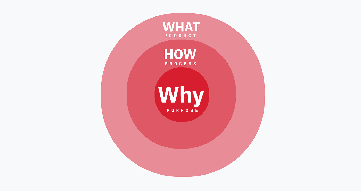
Figure Out The Why.
- Why — the core, the motive, the purpose.
- How — the journey, the process.
- What — the final, end-result, the product.
It’s only when we understand the why that we can determine the how; and the how is what gives birth to the what.
So while they might seem like common sense, these 10 principles are so much more. They matter because they are at the core of why people do what they do. Why people think, and why people act. Why people love you, and why people hate you.
You may not realize it, but these 10 principles have a huge impact on the way users like you navigate the internet each and every day. If you’re considering a website redesign, be sure that these principles are at the forefront of your strategy.

Jakob’s Law
[lead]Users spend most of their time on other sites. This means that users prefer your site to work the same way as all the other sites they already know.[/lead]
This law has been ruling the web for decades. It has been happening since the dawn of the Internet era. Users crave familiarity. Therefore, your website is going to perform better if you use familiar design patterns like:
- Placing your navigation at the top of the page.
- Utility links (cart, account, profile) in the top right corner.
- Using 3 lines (or a hamburger icon) for a fly-out menu on smaller screen sizes.
Sure, you want your website to stand out. But let it stand out in its messaging and design—not in its usability.

Von Restorff Effect
This law was coined by German psychiatrist Hedwig von Restorff, who did an experiment and found that when participants were presented with a list of items where one item was more distinctive than the rest, the memory for the item was improved.
[lead]The Von Restorff effect, also known as The Isolation Effect, predicts that when multiple similar objects are present, the one that differs from the rest is most likely to be remembered.[/lead]
This is the main reason we make Calls To Action look different than the rest of the buttons on a site. Making important information or key actions visually distinctive will not only help your users remember them, but it will help them notice these items in the first place.
It will also prime users to interact. Priming is what happens when the implicit (short-term) memory interacts with an external stimulus; or in our case, a visual stimulus like a button. You see the visual stimulus, and it triggers your brain to interact with it.
People are lazy.
Users will go down the path of least resistance. So why not use that to your advantage by making the desired outcome the most noticeable, the most different, and the simplest path to go down?

Serial Position Effect
Speaking of memory, The serial position effect was a term coined by Herman Ebbinghaus. It describes how the position of an item in a sequence affects recall accuracy.
[lead]Users have a propensity to best remember the first and last items in a series. [/lead]
Place the most important information first, and last. Place the least important information in the middle.
This is why in public speaking courses, people are taught to nail the first 30 seconds and the last 30 seconds. The rest can be terrible. As long as the first 30 seconds grabs your attention, the speaker has you hooked.
That said, we’re about halfway through this blog post…so you’ll probably forget that you just read that ????
The same goes for design. It’s important to start well and finish well.
Here’s an idea you may have not thought of: positioning key actions on the far left and far right of navigation menus can increase memorization, and thus, performance.

Law of Prägnanz
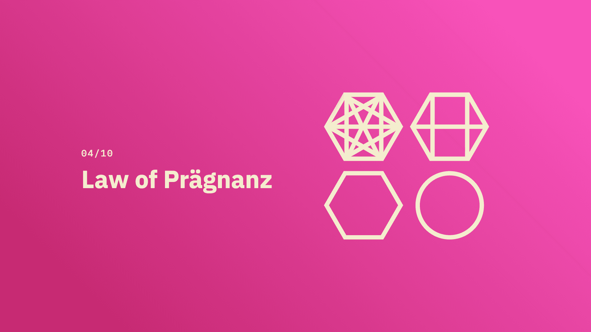
This one, in theory, is a no brainer: people prefer things that are simple, clear, and ordered.
Prägnanz is a German word that means “good figure” or just “simplicity.” When we see something that appears complex, the human eye tries to break it down into simple concepts to decrease cognitive load.
[lead]People will perceive and interpret ambiguous or complex images as the simplest form possible because it is the interpretation that requires the least cognitive effort of us.[/lead]

Have you ever seen a movie marquee sign with the flashing bulbs encircling it? To the observer, it looks like the light is traveling from bulb to bulb as it moves around the marquee. But in reality, it’s a series of bulbs turning off and on and the lights don’t move at all. How we visually perceive the object is much simpler than what is actually happening.
The human eye likes to find simplicity and order in complex shapes because it prevents us from becoming overwhelmed with information. If we had to think about each and every bulb turning off and back on again every time we looked at the sign, our brains would explode.
Brains like shortcuts.
How does this apply to UI/UX design? Knowing that people prefer things simple, clear, and ordered, we can reduce complexity in a number of ways:
- Take a complicated checkout process and make it a multi-step form. Make it multiple pages to not overwhelm the user.
- Reduce the complexity of navigational items by limiting the number of pages in the global navigation and using deeper hierarchy.

Miller’s Law
Limiting the number of items is also important because of Miller’s Law. In 1956, George Miller asserted that the span of immediate memory and absolute judgment were both limited to around 7 pieces of information.
[lead]The average person can only keep 7 (plus or minus 2) items in their working memory.[/lead]
One of the most common complaints we hear about why people don’t like their existing website is because there are simply too many options. Their site feels overwhelming.
This makes sense because our working memory is limited. To accommodate, designers should limit the number of choices offered to users to make it easier for them to navigate a website.
When confronted with too many choices, what happens is what psychologists call decision paralysis. Meaning there are so many options that people are likely to give up and not make any decision at all.
It is important that we minimize the choices the user must make at any given moment, especially in places such as navigation, forms, and drop-downs, all reducing the cognitive load on the user.

Zeigarnik Effect
Zeigarnik was a Soviet psychologist in the 1920s. She conducted a study on memory in relation to task completion. She posited that incomplete tasks were easier to remember than completed ones.
[lead]People remember uncompleted or interrupted tasks better than completed tasks.[/lead]
Have you ever been on trying to purchase something online, putting the items in your cart and filling out all the information, only to get to the end, and the whole site just crashes? You refresh, hoping and praying your information is still there. It’s not. It never is.
Users remember uncompleted tasks. This is the whole reason behind those pesky red badges on your phone’s app icons. You know, the one that says 17,483 emails in your inbox. The reason that badge exists is because of Zeigarnik.
Designers can apply this principle to their websites in many ways. One practice to put in place for any kind of multi-step process on a website is to add a progress bar at the top of the page. This allows users to see exactly where they are in the process, all while reminding them that they haven’t completed the task yet. This can increase the likelihood of conversions on your website.

Pareto Principle
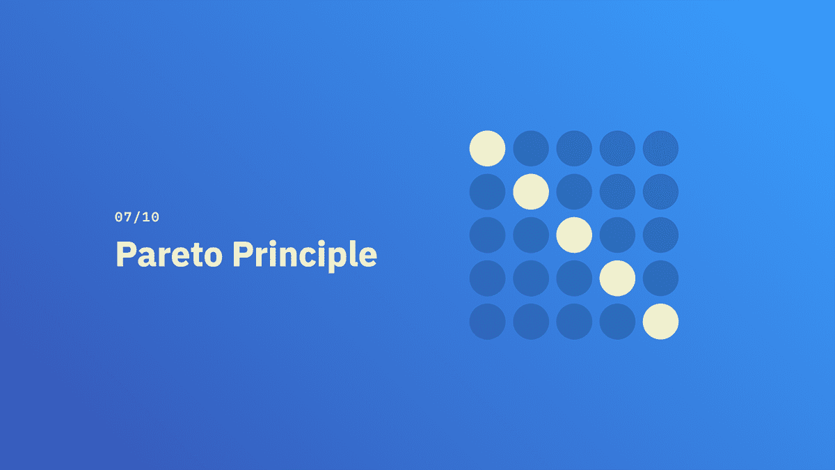
Pareto is better known as the 80/20 rule.
[lead]For many events, 80% of the effects come from 20% of the causes.[/lead]
Pareto was an Italian economist who noticed 80% of Italy’s land was owned by 20% of the population.
This happens A LOT. And it happens everywhere—not just online.
- The richest 20% of humans have ~83% of the world’s income.
- 20% of patients use 80% of healthcare resources.
- In 2002, Microsoft reported that 80% of the errors of Windows crashes were caused by 20% of the bugs detected.
It’s a bit uncanny how the world works.
Designers should spend the majority of the time working on what will bring the most benefit to the most users. Nuances and edge cases are less important, so it isn’t quite as valuable for them to spend time troubleshooting these issues.
For example, instead of spending 17 hours on tweaking a gallery on an inside page that only 10% of your audience is going to see, it’s more beneficial for designers to spend most of their time designing the home page, the header, and important CTAs.
Doherty Threshold
Speaking of time, the Doherty Threshold waits on no one.
There’s a threshold of time that the brain can wait without it feeling like it’s truly waiting.
[lead]Productivity soars when a computer and its users interact at a pace (400ms) that ensures that neither has to wait on the other.[/lead]
In order to keep a user’s attention, you must provide system feedback within less than half a second.
This isn’t so much talking about page load time, although that is connected. This is more so connected to how fast a user expects a result when interacting with a system.
When your users click a button to submit a form, the validation on that form should appear in less than 400ms. If it takes longer, then the user’s attention is more likely to be diverted.
This is especially telling if you ever have to use a really old, slow computer, after using a much faster one. Your brain has been trained to expect the computer to open applications and execute commands much faster than they actually are happening.
What happens when the Doherty threshold is not met is frustration, anger, abandoned carts, unmet conversions. Ultimately, you’re left with unhappy customers that are going to go somewhere else.

Hick’s Law
Remember Miller’s Law? We can only remember 7 items? This one is similar, but in relation to time.
[lead]The time it takes to make a decision increases with the number and complexity of choices.[/lead]
You are costing your users valuable time the more choices you offer them. This is decision paralysis in action yet again.
Instead, simplify the number of choices.
- Eliminate what’s unnecessary.
- Use chunking to break up complex tasks into smaller tasks.
- Avoid overwhelming users by highlighting recommended options.

Postel’s Law
Jon Postel was one of the early pioneers of the Internet.
[lead]Be liberal in what you accept, and conservative in what you send.[/lead]
The law was primarily a design guideline for software, specifically in regards to the transfer of data across computer networks.
This is also known as the Robustness Principle.
What Postel was saying was, when a computer program receives input from a user, it should accept any range of input, no matter what it is. But when the program sends a message to the user, it should be as specific as possible.
Why is this important? It’s important because of the way the brain receives feedback. The mind is bound to “What it sees is all there is…” So if the feedback isn’t clear or accurate, the brain gets confused.
This is absolutely applicable to UI design.
Designers must be tolerant of any number of actions a user could possibly take. This is important when testing an application or website. This means accepting variable input from users (especially in forms), and then translating the input to meet the requirements of the system.
For example, when asking for a phone number, instead of requiring the user to format the phone number in with parenthesis, area codes, and dashes, why not just accept any phone number and then do the validation and formatting on the server side?
Lastly, sending conservatively means providing clear, concise feedback to the user. For form validation, Instead of sending, “there was an error” or “username or password is invalid”, be more specific in your feedback. What exactly was the error? Was the username invalid, or was it the password? Give the user as much feedback as possible so they know exactly how to fix the error.
Having both sides of this law met will result in a website that functions much like a well-tuned machine, firing on all cylinders, and requiring light, easy maintenance.
What These Principles All Have in Common
These principles should give you some insight into why people (including you) make the decisions they do—both on the web and in life!
As you can see, cognitive load has a huge impact on the decisions we make on the internet. With that in mind, the one commonality that all these laws have can summed up in one word: Simplicity.
- We must do what we can to eliminate, reduce and simplify.
- We must find ways of making complex tasks into smaller, simpler tasks.
- We must leverage common design patterns, and not aim for weird, unusual, and never-before-seen tactics.
When you work with a trusted web design team that knows to apply principles and really get to the root of problems online, you can be sure that your website will be easy to use, clearly designed, and offer users a pleasant experience. Above all else, applying these principles gives you the power to change the way people feel about your business.
It will change the way people feel about you.
Hopefully, for the best. ????
Start the Conversation
Interested in learning more about digital marketing and web design?


