
Imagine you were out and about, searching for that new restaurant you’ve been dying to try. You pull up their website on your phone to take a look at their menu, but you have to pinch, zoom, and contort your fingers just to read small, barely decipherable portions of text. So, what do you do? You give up, and you go somewhere else instead.
Mobile friendliness, or the ability for users to interact with your website easily on their mobile device, is a must in today’s digital age, but what does that mean practically?
1. Your Website Isn’t Responsive
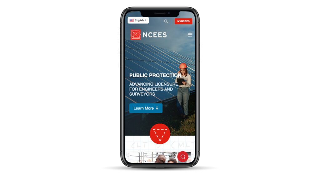
First and foremost, your website MUST be responsive. A responsive site is one where the content adjusts to fit the size of the screen. And whether or not you consider yourself “tech-savvy,” you’ve probably noticed all the different mobile devices that have crept into our daily lives. At this very moment, you could go to your local coffee shop and find a smartphone, a tablet, and a laptop, all being used to surf the internet. A responsive website looks good on any of these devices. Responsive web design prevents you from having to create a different version of your site for every device out there. Your users can have a seamless experience on your website, whether they’re in the office or on the go.

Either build your site with responsive design or hire a design firm who will.
2. Infographics And Tables Are Indecipherable
The goal of infographics and tables is to make content easy to read and digest. What’s easy to consume on a laptop, however, may not be so easy on a smartphone. If the table is responsive (fits to the screen without pinching and scrolling), the text may be too small to read. If the table isn’t responsive, it will be too hard for users to navigate. In both cases, the content actually becomes harder to decipher, defeating the original purpose.
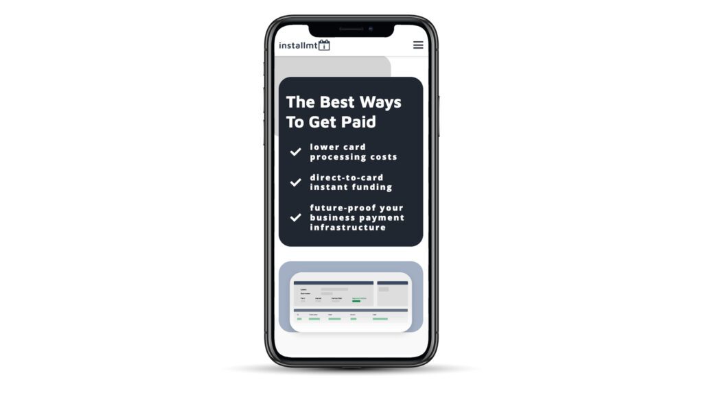
Use infographics and tables that are readable on large and small screens alike, or break up your large infographic into 2-3 smaller ones.
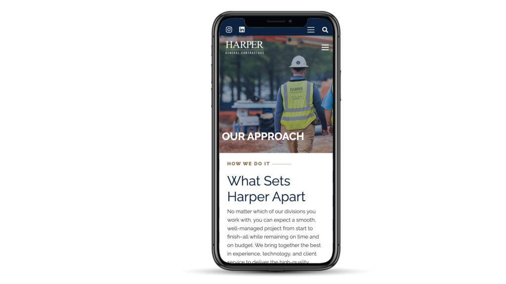
3. Too Much Text
Attention spans in America continue to shorten as the years go by. If you plan to keep a visitor on your website for more than 1-2 seconds, there must be something of value that entices them. A surefire way to ensure your user hits the “Back” button as quickly as possible is to bombard them with a full novel on your website. Too much text is overwhelming, especially on a smartphone where you can’t see the end of it. We promise you don’t need a 5-page company history featured on your site.
Keep your content concise, to the point, and easy to digest by breaking it up with bullet points, whitespace, headlines, and great photography.
4. Buttons And Links Are Too Small
Thumbs and index fingers come in all shapes and sizes. If you have above-average-sized fingers, you know how hard it can be to “tap” links on your smartphone. Buttons and links are where the magic happens on your site, directing users towards a desired goal. They MUST be effective. If Bob is on your site attempting to “Schedule an Appointment” or “Add Product to Cart” and his finger can’t connect with the button, Bob will get frustrated and move on.
Make your buttons large, obvious, and spacious.
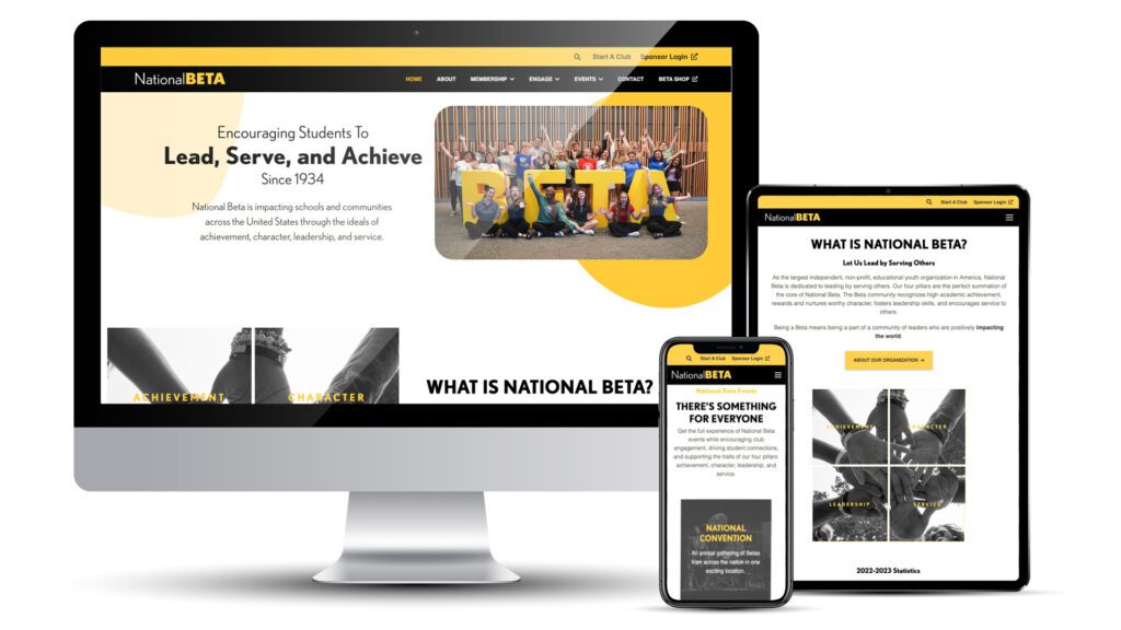
5. Not Showing The Most Important Content First
As noted above, long attention spans are hard to come by in the 21st century. If your user is not enticed by something of value upon first glance, they will get frustrated and leave your site. Users don’t view websites in the same way they would read a novel, expecting the climax towards the end. In fact, users don’t read sites at all — they scan them, hunting for value. If you’re an award-winning home builder and the goal of your site is to have people request a quote, don’t hide that at the bottom of your home page. Make the ask early and prominently so users know what to expect.
Lead with important content, and make your call to action hard to miss.
6. Slow Loading Times
All of the advice listed above is useless if a user never makes it onto your site in the first place. 53% of web users abandon the site if it takes longer than 4 seconds to load. Additionally, slower load times lead to lower conversion rates. It is vital that your website load quickly. There are many tools out there that can help you analyze your site, report your load times, and suggest ways to increase speed.
Analyze your site’s speed to see how you’re doing.
In Conclusion…
 Are you making one of these six mistakes on your website? If so, you may be losing, or frustrating, customers. There’s no denying that we live in a mobile world, with new devices coming out faster than we can keep up with. It’s important to meet your users where they are!


