It’s hard to believe that one of the key elements of today’s business world, the World Wide Web, is only 34 years old. That’s the same age as Taylor Swift, Daniel Radcliffe, Joe Jonas, and Jason Derulo — to name a few. Yet, in those 34 years, the World Wide Web has become something no business can live without.
Today, a business’s website is their brick and mortar online. In 2023, the internet is the space where shoppers can make purchases, clients can interact with trusted brands, and small businesses can connect with people in their community. In other words, it isn’t enough to simply exist online in 2023. Instead, it is critical that your website shows your company in the best light. A key way to do that? Staying on top of the latest and greatest in internet trends.
So what are the web design trends we’re seeing for 2023? Let’s dig in.
6 Web Design Trends for 2023
1. Minimalist web design is in—but make it colorful
Several years ago, minimalism burst onto the website design scene. As a design movement, it was focused on clean lines and sparseness… perhaps too much so. In a chaotic and busy world, clean lines and clear text are still popular, but people are increasingly opting for bold colors and fun graphics to keep minimalism from feeling stale.
A great example of this — CompIQ Solutions. The site has a vibrant blue background that makes the plain white text stand out all the more clearly. As 2023 rolls around, organizations might find that less is more.
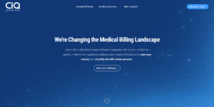
CompIQ’s homepage is eye-catching in its simplicity.
2. Large STATEMENT titles effectively communicate your main thing
Text can be just as much of a design trend as graphics, colors, and video. Over the past two years, we’ve seen a trend toward larger, statement titles that catch a user’s eyes and communicate a simple message. Studies are showing that the modern person has a shorter attention span than a goldfish. Using a clear, bold title to communicate what you do or how your product or service can make a person feel can help a casual reader stop and stay in a world of distractibility.
Take Liberty Fellowship, Hollingsworth Funds, Camp, and GEM Mining. Although drastically different organizations, each homepage leads with a bold title that quickly tells the reader what the organization is all about. Once the initial hook is set, users can then peruse the site to find the information they are looking for.
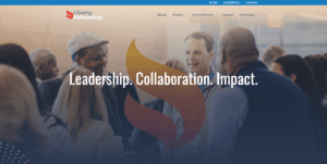
Liberty Fellowship’s homepage features a bold statement title that concisely communicates the heart of the organization.
3. Sharp color contrasts are returning
Do you remember the color-blocking trend in 2010 and 2011 where seemingly disparate colors were paired together in clothing to create a bold statement look? Whether you were a fan or not of the movement, the trend has found a home online.
Let’s take a look at a big player in the design game: https://spotify.design
Spotify’s design site has powerful colors, minimal graphics, and bold text. As you scroll, you can see more content than some sites, but the crisp feel and tight lines still keep things easy to read and navigate. Fun colors, when paired with easy-to-read text, can keep your site eye-catching and memorable without creating a cluttered feel.
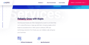
Kopis’ site is also an excellent example of this design trend. White, blue, and pink pop to highlight the most importan information.
4. Subtle movement keeps users interested.
From floating text to images shifting into place to backgrounds fading out imperceptibly — websites are showcasing more movement. Done correctly, subtle movement keeps the user engaged with the site on a subconscious level, directing the viewer toward the specific information they need to see.
Beyond that, it’s visually stunning — taking a flat, two-dimensional product into a clever world that the user can engage with. One example stands out in our minds: https://bikeandbuild.org. The site has gently moving text as you scroll and a cog wheel that spins as you navigate the homepage. It’s fun, playful, and subtly drives home the mission of the nonprofit to engage young adults in service-oriented cycling trips to raise awareness for affordable housing.
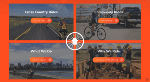
The gently spinning bike wheel on Bike and Build’s page subtly draws attention to important information about the organization.
5. Large graphic images with subtly moving text will continue to be popular.
An old adage says a picture is worth a thousand words, and in today’s web design that just may be the case. Across the board, we’re seeing a shift toward eye-catching images that tell the story of an organization before the header text registers with the reader. This effect is only enhanced by the website text and moves in subtly to reinforce the photo.
Take the Nandina Home and Design website, for instance. As their page loads, you instantly see a stunning modern kitchen with tasteful accents and clean lines that communicates clearly their central message: Nandina is focused on making your home a uniquely YOU space. The words that flow across the screen afterward, “Make your home personal,” further highlight and reinforce that message. From that initial introduction, Nandina artfully cycles between various images that show the user what their home could look like. The phrase, “Make your home joyful,” is matched to an outdoor porch with a fire pit, a bottle of wine and a lovely backyard. The phrase, “Make your home purposeful,” features a grand piano, and the statement, “Make your home a sanctuary,” stars a master suite with cozy accents and a peaceful ambiance.
In 2023, images and video will continue to impact web design, and organizations will find that it’s easy to communicate quite a lot without saying all that much.
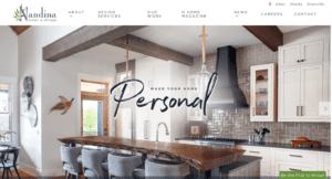
Nandina Home & Design’s website is full of vibrant photos that communicate their service offerings with artistic flair.
6. Video will be everywhere from homepages to about us pages and beyond.
If an image is worth a thousand words, then the worth of video is irreplaceable. As more and more platforms push video content, like TikTok, Instagram, and YouTube Shorts, users will continue to expect and appreciate easy-to-digest video content.
Take Sunland Logistics Solutions and Greenville Tech Foundation for example. Upon loading the pages, a website visitor sees videos that clearly showcase that Sunland Logistics Solutions is a company dedicated to supporting supply chains and Greenville Tech Foundation is committed to helping students with their higher education goals. For both organizations, a forward-facing video highlights the wide variety of services they offer while still directing a website user towards the information that matters most — next steps for involvement. Video is also used in clever ways throughout both sites to draw a user in and communicate the vision and purpose of each organization — just check out Sunland’s “Who We Are” page or Greenville Tech’s Student Success Stories.
Video continues to be a dominant design trend and updating your website with key video elements can help you connect with users who need information in a quick, easy-to-digest format.

Sunland Logistics Solutions homepage features a brilliant video of the company in motion – a fitting scene for a logistics company focused on solving transportation issues.
Web Design: Changing, Yet Staying the Same
The internet is growing and as it ages it changes. The biggest web design trends we’re seeing for 2023 are a reflection of that. As things change, however, other things stay the same. By focusing on your user and their experience on your website, and by having a strong strategy to help guide that user toward your goal, your organization will see success online.
Start the Conversation
Want to know what web design trends would be a good fit for your organization?
