As a business owner, when you’re looking to update your website—or have one made for the first time—the first thing you’ll probably think about is how you want it to look. You’ll want to add additional graphics, update team photos, and list new services. Websites, after all, are a way to visually represent your business online.
But a truly great website is much more than that. What often gets overlooked is the critical role that organization and content play on your website. While it’s true that websites need to properly reflect who you are as a business, they also should be designed with your customer in mind. Your customers are, after all, the ones who will ultimately be spending the most time with your website.
Crafting your website around your customers’ needs is what we call content-driven web design.
What is Content-Driven Web Design?
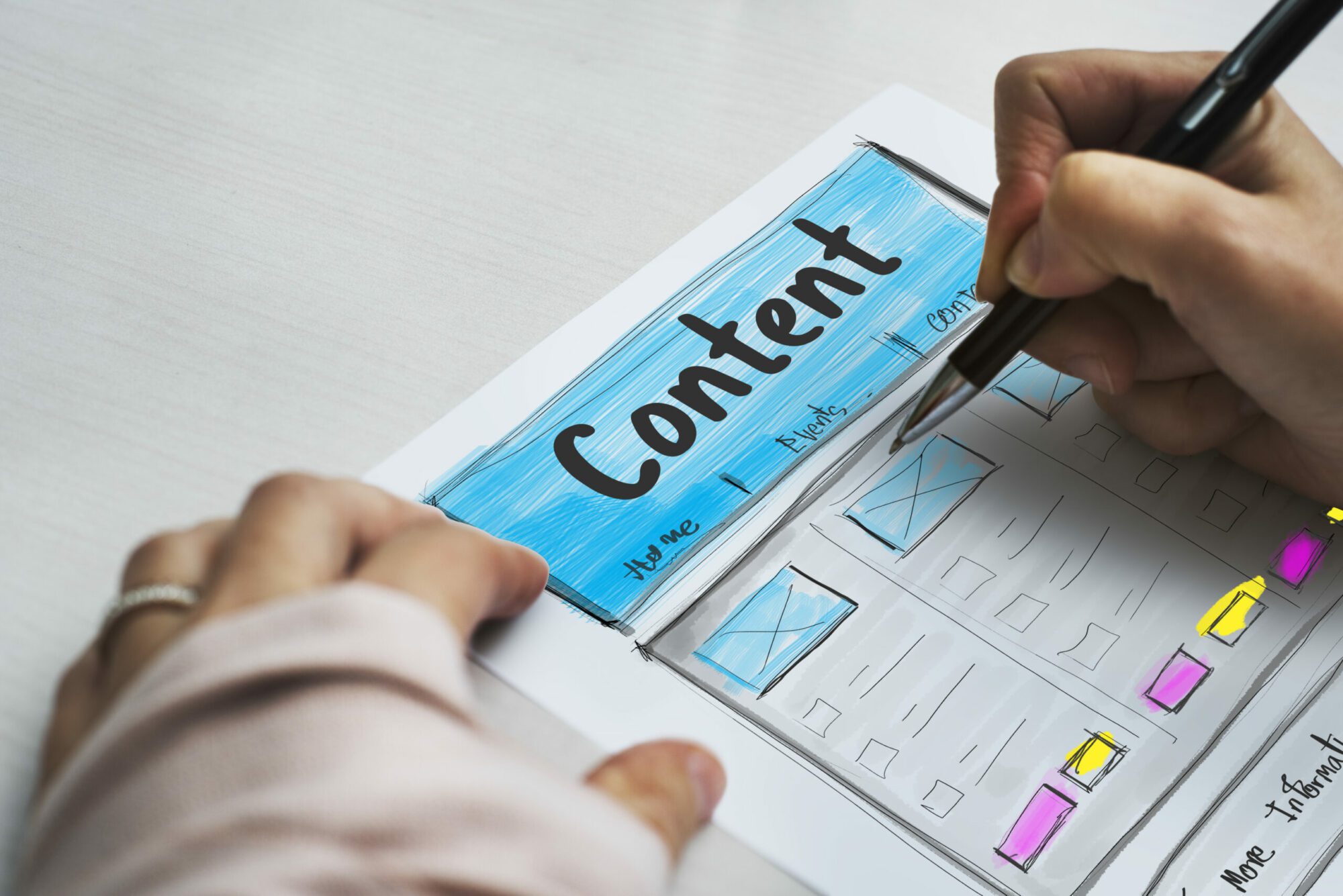
Content-driven web design is a method of website design that involves using content and page structure to inform visual design on a website. Which means what exactly? It means before you start sending your web designer photos, graphics, and color choices, you first need to think about what words you want on your website and in what order those words need to appear.
The Principle Behind Content Strategy
The guiding principle of creating strategic content for your website is simple: content hierarchy. Content hierarchy is a way of prioritizing the most important information a potential customer will be looking for. We always go back to the customer. What will they be looking for when they reach your website? What service are they interested in or what questions do they have? Your company history and/or photos of your staff might be good supplemental information, but they’re not (in most cases) the main things a potential customer is looking for.
Let’s say for instance, that you’re a restaurateur with a new location on Main Street. While visitors might want to meet the chef and read the history behind your concept… their primary goal is to find your hours of operation and your daily menu.
Content hierarchy is the principle to follow to ensure customer needs stay at the base of all website decisions. As you implement content-driven web design, it’s best to constantly refer back to what information your target audience might be seeking in order to determine what information should be prioritized on your site.
Why Use Content to Drive Your Website Design
Using a content-first strategy is important for several reasons:
- It forces you to take a step back and think about exactly what pain points you’re solving for customers. This dedicated reflection helps you keep your business goals top of mind, and keeps the mission and purpose of your organization clear both internally and outside the organization.
- It makes you prioritize the needs of customers over the needs of other internal departments. We see this a lot. Each department thinks their information is most important and must be highlighted first on the website. But ultimately the most important information is the information the customer is searching for.
- It can save you time and money. By developing a clear strategy of how many pages you will have on your website and what will be on each page, you and your web designer will have an agreed-upon plan. This will protect you from vague agreements about how many pages you’re allowed to have.
The Method of Content Driven Design
Now that you have the what and the why you need to know the how.
Developing a content strategy might sound daunting, but we promise it isn’t. In fact, the process can be broken down into three steps: site structure, page structure, and content. None of these steps exists in a vacuum. In fact, they are all closely related and should be viewed more as building blocks than independent tasks.

First things first, you’re going to want to start big.
Before you even consider the words on a page, you’ll want to come up with a functional site map. The site map will then inform how each page is structured. Once you’ve decided how each page will be structured, then you can nail down the actual content. This content then guides your designer.
Let’s define some of those terms.
What is a site map? A site map is a list of all the pages on your website. These can either be a numbered list or shown as a visual. (See the graphic below for reference)

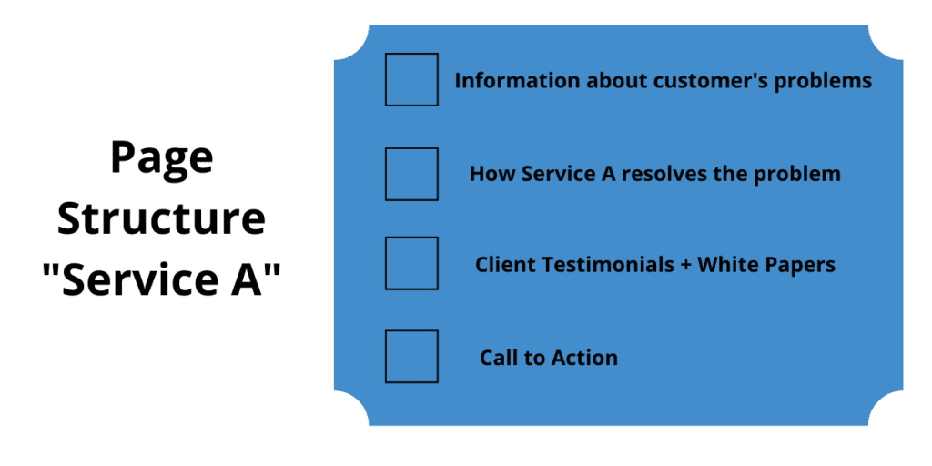
What is page structure? Page structure refers to a detailed outline of what content is on each specific page on your website. It should be created after the site map.

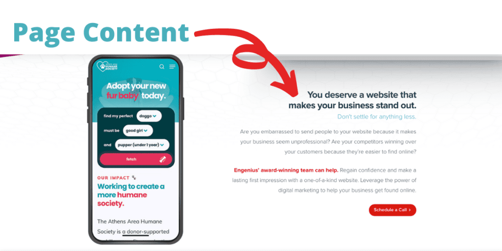
What is content? Content refers to the actual words/copy you use to fill in your page structure outlines. This is the final piece of the puzzle and should be created last.
The Process of Website Content Strategy
To create a customer-centric, content-driven website, we need to explore how content hierarchy fits into site structure, page structure, and content.
Site Structure
To best understand what site structure is and how it fits into your customer first design, let’s check out an example.
This video demonstrates an overwhelming navigation/menu and a homepage that doesn’t direct the visitor to any particular action. When a visitor gets to this page, they don’t know where to go. Even if they use the main navigation, hovering over an item gives them hundreds of other options. There is no clear path for the user to take. Decision paralysis sets in and instead of learning about a product or service, they exit your website.
What does site structure look like when you institute content hierarchy? Let’s take another look.
With a newly designed version of the above website, the customer is guided down a homepage with very clear direction. The homepage now identifies and calls out the most important actions users on the website want to make. The new navigation at the top of the page is condensed into broad categories so the website visitor is not overwhelmed by a long list of options.
It is important to note that good site structure doesn’t mean simply eliminating a lot of pages. There are a lot of well-structured websites that have a lot of pages. The key is to organize them appropriately. There’s no “magic formula” for the “right” size of a website. You don’t want to look at all the content on your site and just say “nope, it’s too big, let’s nix it all.” This site still shows the same content, but it’s organized more effectively.
Another example is The City of Mauldin. When we were first handed this project we did not recreate exactly what they had using the same format. Instead, we went through, audited each page, and reorganized the content into bigger, more digestible categories for the audience. Regardless of if you have one audience you are speaking to or many (like a city website) you can identify important user paths and create an effective site structure.
Page Structure
With page structure, we apply the principle of content hierarchy to an individual page by prioritizing the most important information and making sure it appears early on. Typically, you’ll want to start with your homepage because it acts as the train station that routes users to different areas of your website. As you create the structure/outline for each page, think about what messages are most important to get across. This should be based on marketing priority and customer needs.
Each page on your website should have a clear path to action. You never want a customer to get to the bottom of your website page and have nothing to do. You need to call them to action. If you had a customer walk through your brick-and-mortar store, fill up their cart and walk back to the checkout counter, you’d want your associate to ask them if they are ready to check out. Without the ask, they might just leave their items and head home if they can’t find anyone to ring them out.
The same idea should be applied to your website. As you think about what each page needs to say, think about what ‘ask’ makes the most sense, and keep your customers moving towards that checkout—even if the “checkout” is a figurative one to reach out for more information.
To get a clear idea of effective versus ineffective page structure let’s take a look at another example.
In this first example, you see a homepage without a clear call to action or any page structure. All the text is in large paragraphs and the buttons on the right are big, making the visitor think they are important, but it isn’t clear (unless you are a current customer) what those buttons are for.
After looking at this homepage, a potential customer is left with nowhere to go and they are not being called into any kind of action.
With a little page structure, this newly designed homepage for the same company gives users direct calls to action and guides a potential customer through important information.
- Visitors are immediately directed to either view a printer or explore IT solutions (the company’s main two offerings)
- Visitors then get an overview of who the company is and have the option to learn more
- Then they are prompted (again) to view printers and copiers
Giving clear, concise actions for your visitors will help empower them to explore your site on their own terms and discover all you have to offer.
Content
Now comes the fun part—filling in all your outlines with actual content. When you first set out to redesign your website, you may have felt overwhelmed when asked for ‘content.’ But, if you have properly laid the groundwork with site structure and page structure, the content writing will come easy.
At Engenius, we typically write content for our clients, keeping things like clarity, conciseness, SEO best practices, target audience, and brand voice in mind. (Interested in learning more about how our content writing process can help your company? Contact our team here and let’s chat!) Even if you don’t plan on working with a copywriter, though, you should be in a good place to craft well-written, easily digestible content that calls your visitors to action.
Content Writing Tips
Your website content should always be user-focused. It is important to explain what you do and how you do it. We know, this sounds like a no-brainer. But it is easy to get caught up in the daily lingo and jargon of your own industry. What might seem like common sense to you often isn’t to your customers. Ask yourself what level of understanding your audience has of your products and services and write to that level — take the time to explain what you do and how you do it. In today’s world, consumers like to be in charge of their own research and buying process.
As you write content it’s important to consider:
- What does a client need to know about your industry and services?
- What industry terms might be confusing?
- What can you simplify, clarify or rewrite?
- Is your writing “snackable,” or easily understandable by a potential customer?
- Does your writing encourage the reader to perform the desired conversion? (such as filling out a form, calling your office, etc.) ?
- Is your writing grammatically correct?
With a content-driven website, you will be worlds ahead of your competitors and prepared to engage with the world’s internet-savvy consumer.
Start the Conversation
Interested in learning more about how our content writing process can help your company?


