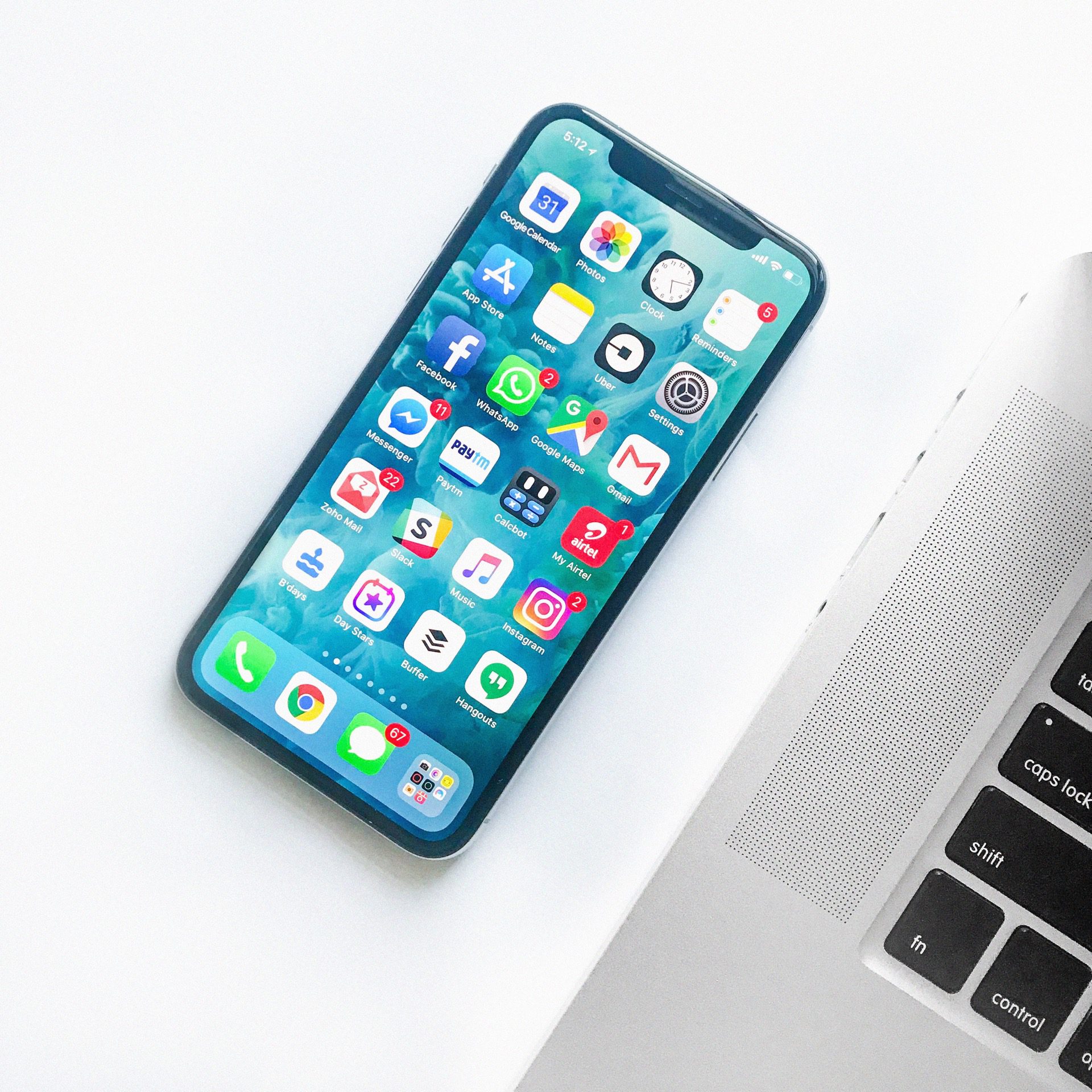
“Mobile-friendly” is a bit of a buzz word right now. With smartphones in the hands of nearly 70% of Americans (not to mention all the tablets, phablets, and smartwatches out there), people are making mobile seem like a pretty big deal.
And the hype is real — mobile is a big deal.
Unfortunately, a lot of people are confused about what “mobile-friendly” actually means, why it’s so important for your website and, therefore, your business. We’re here to cut through the noise and resolve three common misconceptions, so you can learn what’s really going on with mobile.
1. “But I have a mobile version”
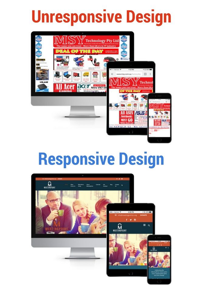
As stated above, the majority of Americans now use smartphones, but a significant percentage now own tablets as well. In addition, wearables like watches and glasses are gaining momentum. Heck, you may be surfing the web from your fridge in a few years. So keep in mind, having a mobile version does not equal mobile-friendly. You might be thinking, “Does this mean I have to make a different version of my site for each device?” Technically, that is an option, but we recommend responsive design.

Remember, “mobile” refers to a lot more than just phones
2. “But I have a mobile app”
For a long time, many companies (even large ones like Amazon) held off on making their sites mobile-friendly, and instead built mobile applications. This simply won’t cut it anymore. Potential customers don’t start their search for you in the app store; they start by going to Google, and you must have something to offer them there.
3. “You can still view my site from a phone”
Just because your site can be viewed from a mobile device doesn’t make it mobile-friendly. Mobile-friendliness is about much more than showing up on a phone. It’s about the user’s experience on your site. You can’t build a brand when people are having to pinch, scroll, and zoom their way through your site. And you can’t sell a product when the “Buy Now” button is too small for your user’s thumb.
Mobile is set to continue its growth, and users already spend more time surfing the web on their phones than traditional computers, so make sure you understand the significance of mobile and the importance of having a mobile-friendly website.


