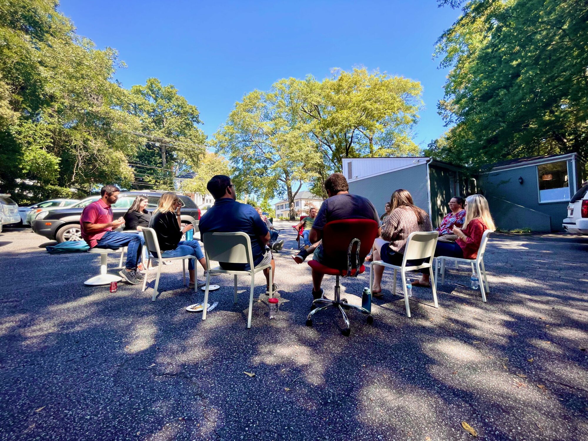
What makes one website stand out from another? If you think about sites you’ve seen and really loved, can you name what it was that made them memorable? People often look at their company’s website and think, “all the right words are there. But something’s just missing.” We’d like to propose that the “It Factor” that makes you love one site and not really think twice about another boils down to photography.
Sometimes eye-catching photography is front and center; you are met with an amazing image as soon as you visit the homepage. Other times photography is used more subtly—as a texture in the site’s background or a header for a specific section of a page. Regardless of where imagery is used, what factors make it effective and powerful as opposed to merely decorative?
Authenticity
Websites are all about telling your brand’s story and drawing people in to take action or learn more about you. It’s important to select photography that accurately represents your company. Its message should be truthful and real—a testament to who you are and what you do.
If you need to use stock photography due to budget or time constraints, make sure the images you choose are realistic for your business and try to find something unique that hasn’t been used on a million brochures and websites already. Avoid stock images that very clearly do not include your team members or office space.
Ultimately, custom photography has the “It Factor.” Hiring a pro allows you to get top-notch photos of your product, your people, and your projects. Start by brainstorming photo ideas with your photographer. Dream big about the kind of photos that would best represent your brand and then work together to make them happen! It will take time, planning, and money, but if it’s feasible, we highly recommend it.
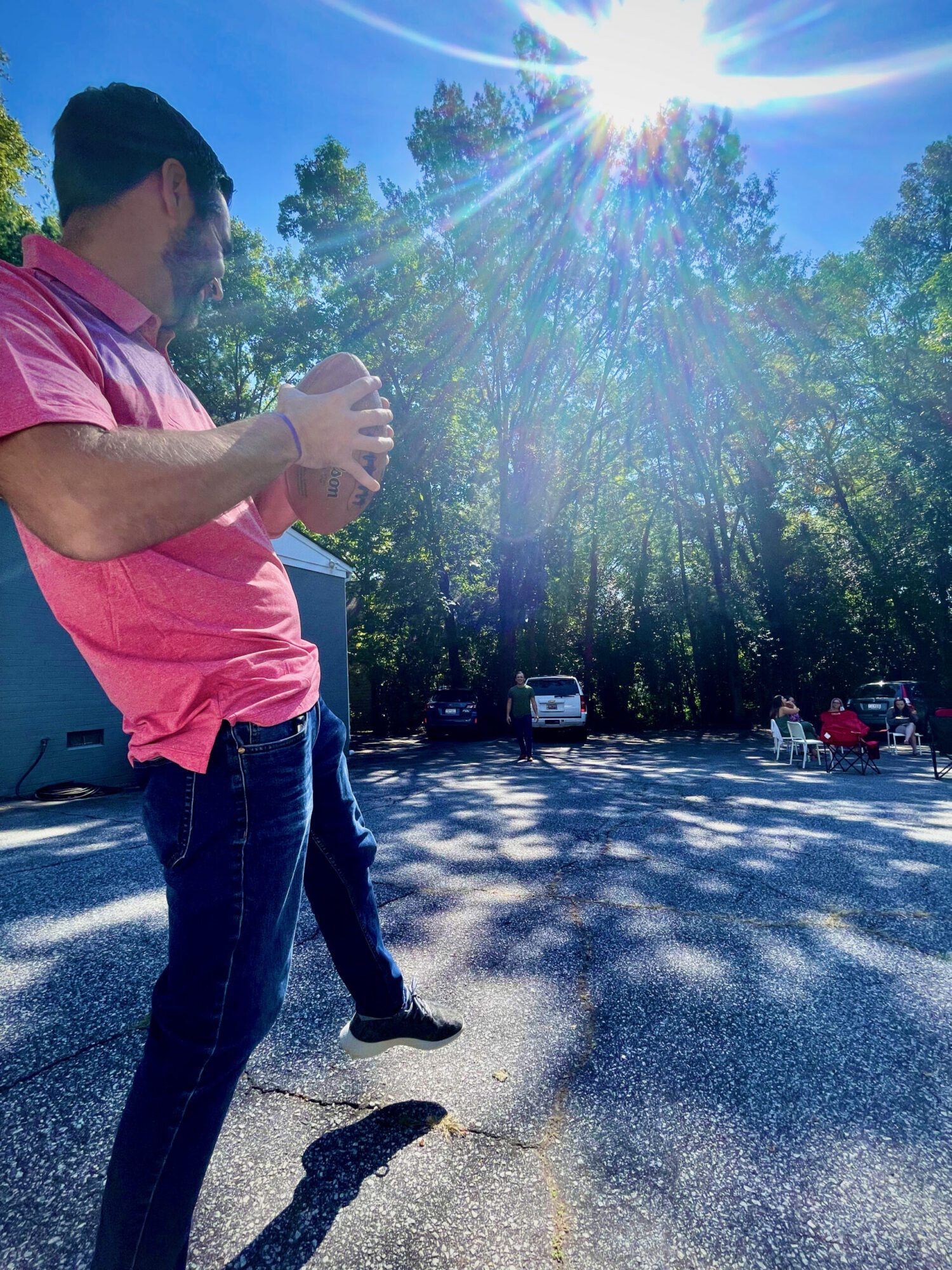 This photo is from one of our internal website photoshoots. It captures the camaraderie of one of our team lunches and is an authentic and artistic representation of our core value: Be Fun. Using photos with creative angles and bold colors to help reinforce the copy on your website can take an average site to the next level.
Messaging
The phrase “a picture is worth a thousand words” might sound cliche, but it’s popular for a reason. The average person only reads 20 percent of text on a webpage. With 65 percent of people identifying as visual learners, it’s a no-brainer: If you can capture your brand’s message in an image, it will resonate with your users much more than mere text.
But how can you capture such a broad message in a photograph? Well, if you deliver gourmet pizza with fresh, local ingredients, you can convey so much more with a captivating photo of your cheesy pizza straight from the brick oven than you can with words— or even a generic photo of a delivery box.
By the same token, if you’re a human services nonprofit, don’t show us your office building. Show us someone who has been impacted by your work. (PEOPLE resonate much more than things!)

The Message: Hi. We make generic pizza just like everyone else.

The Message: You will be delighted with our gourmet pizza – from our oven to your door!
Quality
Of course, great subject matter can only go so far if a photo is not high quality. But what exactly defines “high quality”? Some factors to consider include:
- Lighting – Indoor photos can be hard to capture, so be sure your subject is well-lit. Place your light source in front of your subject rather than behind it. Outdoor photos offer nice, natural lighting, but often have to contend with glares and shadows, so consider this when choosing your setting or backdrop.
- Background – Make sure whatever is in the background is not distracting from your main subject. This is especially true of employee headshots!
- One central focus – Don’t try to capture too much in any one photo. Focus on simplicity. Caution: photos of crowds/events are at risk of having no central focus.
- Captured candid moments – Candid moments are the perfect way to embrace authenticity! For example, try to capture photos of your team in their natural work environments rather than harshly posed around a conference table. Aim for an authentic look.
- Unique angles/perspectives/focus – Let’s face it: some subject matter just isn’t that interesting. If you find yourself in this situation, consider unique angles or experiment with different focal points in the shot. It doesn’t have to be abstract or artsy, but it can be interesting. (The pizza/oven photo above is a great example of a unique perspective.)
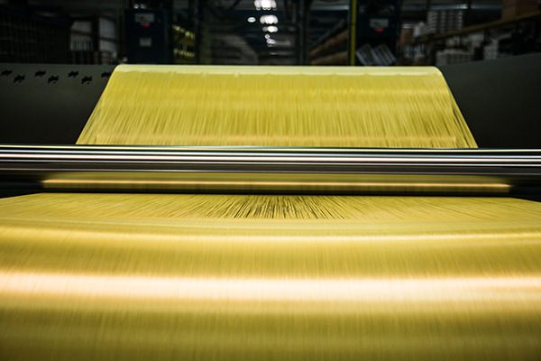
Instead of distance shots of their machinery or plant, our client Warptek did a great job taking interesting close-ups of one of their products being created. Props to photographer Libby Williams!
Photography can truly make or break your company’s website. If you find yourself stuck or aren’t sure where to begin when it comes to selecting photos or creating a shot list, reach out to us! We’d be happy to offer advice and determine which images are best suited for the web.
Start the Conversation
Interested in learning about how we can help make your website more compelling?
