You may have heard of the hero section of a web page from your web designer friends. Yes, it’s really a thing, and it’s quite important! In fact, it’s pretty much the main feature on every home page you visit.
Web designers spend a lot of time working on them, and the results can be spectacular (just take a look at Harper General Contractors) This article will explain what hero web design is, why it’s important, and the different elements involved.
What Is a Hero in Web Design?
The hero section of a web page is the first area that visitors see, making it the most valuable space within your website. This section can create a sense of awe in your visitor or repel them into the arms of waiting competitors. As you can surmise, a great first impression is your key to attracting and maintaining attention.
Not all web pages need hero sections, but the ones that do are typically home pages. Your website’s homepage makes good use of this web design best practice.
Your landing page should aim to achieve the following:
- Introduce your business
- Tell the visitor why they’re on the page
- Detail what you can do for the user
- Explain how they can benefit from your help
- Outline the immediate next steps
Ideally, the above criteria should be accessible without the need to scroll. Once the reader confirms they are in the right place, they can soak in the supplied information and move toward your call to action (CTA).
There’s a lot to absorb, so don’t worry about getting everything right the first time around. Let’s take a deeper dive into the different hero elements.
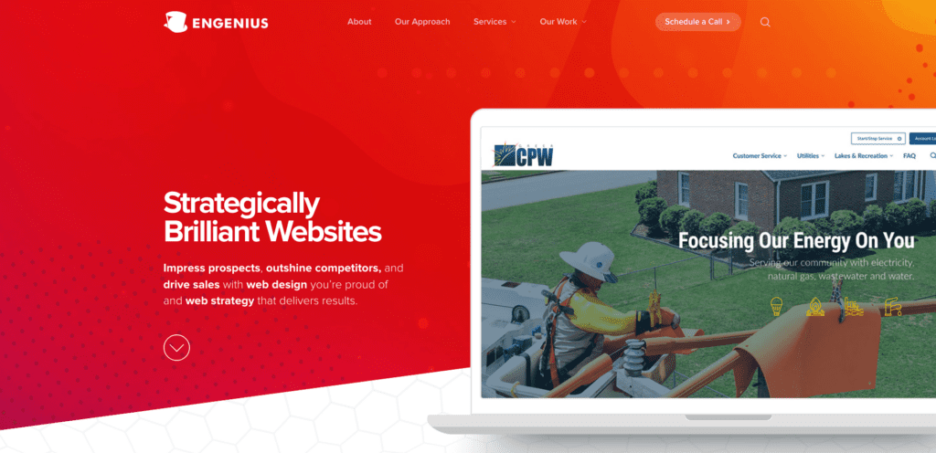
Engenius’s homepage is bold and colorful, while calling out what we do (build websites) and how that impacts our clients (drives traffic, sales and more for them).
The Elements
The hero section of your web page can have several elements that work together as a coherent unit. The first four elements are mandatory, while the rest is up to your discretion to include or leave out:
- Image
- Headline
- Subheadline
- Call to action (CTA)
- Menu
- Social proof
Hero Image
The hero image is a large graphic at the top of the page that also serves as the background. Visitors typically see this image or video first, so choosing the best one for the job is crucial.
A good hero image should grab attention, relate to the purpose of the page, and be completely unique. If this is your flagship brand, then investing in quality hero image web design could be your ticket to the top.

Tonn and Blank’s hero video draws users in and emphasizes the scope of Tonn and Blank’s expertise. See the full site at https://tonnandblank.com.
Headline
The headline is the giant line of text found near the hero image, which means it’s the first set of characters that people read. As you can imagine, these words have a massive impact on the user, so take your time to craft the best message possible.
Here are some things to keep in mind while generating an emphatic headline:
- Tell them what you have to offer.
- Be direct about your product or service.
- Use few but punchy words.
- Shy away from including your brand name, product, or motto.
- Gear it toward the intended audience.
If you’re in a rush or struggling with writer’s block, try throwing up a headline just to see if it works for you. Don’t be afraid to think of several versions of the same thing. It could take a few dozen tries before settling on a suitable combination of words. Spend a lot of time on the headline element because it matters!
Even after deciding on an initial headline, you could choose to change it when the mood strikes. It’s vital to be flexible to keep your branding consistent, especially in the face of a website redesign.

Ultimately, a headline and subheadline should work together to communicate your organization’s mission. While NCEES’s headline emphasizes their mission, their subheadline explains exactly how they protect the public. https://ncees.org
Subheadline
The subheadline is the body of text that immediately follows the main headline. It continues the main message with supporting sentences that help clarify things further.
A strong subheadline will contain two to three sentences, highlight benefits, mention features, and contrast with competitors. If done correctly, the subheadline will keep users on the page longer, which could lead to continued engagement with other parts of your website.
Call to Action (CTA)
The call to action (CTA) provides instructions on what to do next and is mandatory for every landing page. A solid CTA will steer users toward completing a purchase, subscribing to a newsletter, or other actions such as leaving a comment.
A landing page without a CTA is one that leaves people confused and without a path of action.
When constructing your CTA, try to use verbs to convey action. Protip: Use a big, bright button if possible to ensure people can find it without trouble.

Kopis’s hero immediately directs the user to the next step: scheduling a call. https://kopisusa.com
Menu
The menu of your web page contains links that help users find what they need.
Brands generally include a menu to help visitors navigate the website.
A variety of menu styles exist. For instance, you could hide it in a button in a minimalist manner or spread out your links for design purposes. Try variations of common words like about us to add a custom flair.
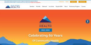
Blue Ridge Health System’s homepage has easily navigable menus to help patients find the information they need. https://www.brchs.com
Social Proof
Social proof items indicate popularity, viability, and satisfaction. This design element can encourage users to indulge in their desire to be part of emerging trends.
Social proof buttons include:
- Photographs of people enjoying your product or service
- Videos of people interacting with your product or service
- Video or text testimonials
- High ratings from reputable review sources
- High-profile, name-brand clientele
Although not always applicable, social proof is the icing on the cake for many products and services.

Caption: The Greenville Tech Foundation’s hero features students in a variety of Greenville Technical College’s programs. https://greenvilletechfoundation.org
Hero Web Design Is Your Superpower
The hero section of your website is arguably the most important part of your web design endeavor. A functional hero section attracts attention, conveys pertinent information, and proposes the next possible actions. Take the time to design an awesome hero area that includes all the core elements because it could potentially pay back dividends.
Now that you have a better grasp of the hero section of your landing page, it’s time to go out there and create, create, create! Of course, we’re here to hold your hand through the entire hero web design process. Schedule a call for a consultation today so we can help design the perfect hero section for your business. Engenius is available to assist with any industry and can tweak things according to your standards. We hope to hear from you soon.
